Moire pattern beats errant LCD into submission
Helen has an Acer AL1916W monitor. It’s widescreen, it’s nice and it mostly gets used with my Xbox (for which it’s fine). However, it’s -always- been slightly blurry when used with her Mac mini. This is made even worse (for me, I don’t think that she notices) by the fact that the blurriness is not uniform — the middle of the screen appears way sharper than the edges, giving it a 1950’s CRT vibe.
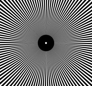
The “Auto” button didn’t fix things— I’d see a few moments of clarity before it decided that blurry was, after all, what I had wanted. The plainer the screen was, the blurrier “auto” defaulted to. I decided to give the screen the most difficult thing to display I could, the moire pattern above.
Displaying it without adjustment caused it to visibly phase in and out, pretty in a way. Finally, pressing “auto” has left me with headache free text. I’m pretty sure H won’t notice.